Microsoft 365’s New Copilot Chat: Unified Experience or Hidden Regression?
The very welcome addition of a ubiquitous Copilot Chat experience in the main Microsoft 365 apps might be hiding an unfortunate regression in just how much Copilot is truly the UI for AI.
Message center post MC1150985 outlines a complex web of changes related to Word and PowerPoint features connected with Copilot Chat integration and new context buttons for Copilot interaction. It was complex enough that I decided to try to work what was being explained by trying it out.
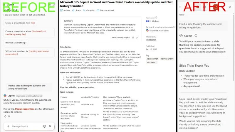
In PowerPoint Online I still seem to have the old Copilot in PowerPoint chat experience, but in the PowerPoint app, I have the new Copilot Chat side panel view. Copilot Chat adds a lot of options that weren't there before, but for a simple instruction that was no problem for Copilot previously like "Insert a slide thanking the audience and asking for questions", there is now no access for Copilot, and it would appear it will now rely on the new controls.
I have argued that an equivalent chat experience throughout Microsoft 365 is essential for Copilot's success since it was first released, but this coming hand-in-hand with a functionality regression and a more complex UI was not the bargain I had in mind.
My hope is that either this is a temporary step along a path to something better, or me just not seeing something that is fully rolled out yet. However, the message center post seems to make clear that the experience I'm seeing is indeed the one that is intended right now.
What impact do more Copilot-featured contextual controls rather than just a chat interface have for your adoption of the product? Is this a step in a necessary direction to make Copilot more accessible to all, or is it a backward step in a useful interface more users get familiar with every day?
First posted on Linkedin on 09/11/2025 -> View Linkedin post here